Some new arrivals sparked this post about the Slam City Skates logo and what it represents. We are pleased to have Slam City Skates Logo T-Shirts and hoods back on the rails. These staple items have been available for decades.
![]()
Our Classic Logo Hood now available in three colours. Following Words by Jacob Sawyer
We’re always stoked to see our logo in the wild, captured on the streets, or in photos. It’s taken on a life of its own and meant something to many different generations. To coincide with the new Slam clothing that has arrived we took a step back to consider the logo from other perspectives. Visually it remains unchanged from the first time it ever appeared. Chris Long designed the text-block logo for Slam founder Paul Sunman when he first opened the shop in the basement of Rough Trade Records on Talbot Road. One year later this logo began its journey into a world wider than West London when it first appeared in print…
![]()
The first Slam City Skates ad in BMX Action Bike May 1987
This ad appeared in the May 1987 issue of BMX Action Bike. This was the first issue of this publication to feature the words ‘Read and Destroy’ on the cover. Skateboarding was still supplementing the bike magazine. Less than a year later RaD would become the dominant name on the masthead and a new era would begin. The Xerox-assisted mail order advert above was assembled by Paul, a functional half-page beacon boasting the extensive inventory of this basement start-up
One thing that set this image apart from other product-heavy adverts from the get-go was the corner stamp appearing next to the already-established Rough Trade logo. The association with the record store carried weight but the Slam logo itself already had a certain authority. In the words of Dan Adams who was part of the Slam family from the beginning, “There are logos sometimes that just work, it’s not possible to say why they do, they just do, and this is one of those”.
“There are logos sometimes that just work, it’s not possible to say why they do, they just do, and this is one of those”
![]()
Rough Trade and Slam City Skates signage at Talbot Road. Slam logo hand-painted by Dan Adams
Dan has good reason to clearly remember this logo appearing. When the shop first opened he was the one who painted a 1.5 metre squared version of the logo next to the Rough Trade signage outside. He did a massive blow-up of the logo as a template and employed good old-fashioned signwriting techniques to announce Slam sharing the building. He even got some static from the business next door for some errant white paint making its way onto their shopfront. Dan is currently steering the RaD archive into book form. He describes the Slam logo as being “not unlike the RaD logo. It has an integrity and visual impact that makes it stand out”. As RaD evolved so did Slam and In 1988 a new Covent Garden location was announced.
![]()
This Ken Park advert announcing the new Slam location appeared in RaD magazine in 1988
This “New & Improved” advert contains a lot of information. Ken Park is doing a one-foot egg-plant on the Slam-built Latimer Road vert ramp designed by Dan Adams. Phil Chapman and Shane O’Brien are called out as sponsored riders, and the upcoming new location that would replace the West London shop is announced. The black and white of this ad emphasises how bold the logo could appear to be and this monochromatic working of it would continue. Tim Fowler who worked for Slam City Skates as a graphic designer when our mail-order ads were an integral part of the business spent more time playing with our logo than most. He said it would always conjure up the feeling of DIY creativity and camaraderie. Tim, who now fittingly works for Rough Trade records, said “Everything this logo represents stems from the idea of creating something exciting and new, all from the basement of the original shop in Talbot Road”.
“Everything this logo represents stems from the idea of creating something exciting and new, all from the basement of the original shop in Talbot Road”
Long before he had skated the streets of London Olly Todd recalls the effect this block of text had on him at the time. “The Slam logo is on my Mount Rushmore of skate logos (alongside Powell Ratbones, Santa Cruz Slimeballs and probably the H-Street logo); it’s just immutably there on my consciousness from a time in the late 80s when I was most receptive to skating’s visual language”. It’s amazing hearing Olly likening the shop logo to such iconic imagery. More than a decade after Olly became aware of this logo we proudly added him to the Slam team and he could often be seen repping the shop…
![]()
Olly Todd Noseblunt slides at southbank in his Favourite Slam shirt. PH: Dominic Marley
Olly further expanded on his perception of the logo for us, saying, “Some skate company logos, you see them and you just get the feels. They serve as a direct connection to your childhood and all the halcyon wonder of that time. It’s almost ineffable, that feeling, for me. The Slam logo is cool too. Timeless. Few things date faster than typefaces, but the Slam logo typography has never fallen victim to that. From the swing sign above the door at the Covent Garden store to the iconic early 90s print ads to the bold-coloured t-shirts of the mid-naughties (I had a sick black print on orange one), wherever it’s appeared, the Slam logo has carried that clout and kudos”.
“Some skate company logos, you see them and you just get the feels. They serve as a direct connection to your childhood and all the halcyon wonder of that time”
Olly also offered his thoughts on what the Slam logo represented, and has come to represent for him. “From its almost unreachable status to me as a kid growing up in Cumbria, to being able to put stickers of it on my board as a shop team rider, the Slam logo has meant different things to me over the years. In the end, what it has come to represent is friendship. The skate crew I met in London when I moved there in 2001 – all friends to this day – spent more time together in the Covent Garden store than any other building, skate spot, or pub. With that store now gone, the logo is a link back to that community, which, it’s no exaggeration to say, was like a second family”. We were made up to hear these musings and pleased that we were that building for Olly and many others. Slam team rider Helena Long also ties the logo to the physical shop saying “It represents a landmark in London skateboarding culture. That hub where you’re just hanging about nerding out over all things skateboarding”.
“the Slam logo has meant different things to me over the years. In the end, what it has come to represent is friendship”
Skateboarding’s radical evolution involved different peaks and troughs and from 1988 to 2015 the Covent Garden location saw them all. Our logo above Rough Trade’s remained a constant though, swinging in the breeze above the window. Throughout our story as a shop, the logo has been a central theme appearing on bags, boards, clothing, stickers, and even on some wrist pouches fondly recalled by Chris Pulman. We have experimented with the logo over the years but have always returned to that original imprint. There is a DIY ethos still attached to it that stems from its inception, a stencil-ready construction at it’s core.
![]()
Slam City Skates T-Shirts have been in the ether ever since the shop opened its doors, if you squint, you will notice that they are listed in the ad which opens this piece for just £7.95. Our logo was in the streets from the beginning. Stickers and shirts meant that team riders and regular customers took the logo with them on their travels, and tourists took shirts home. The dissemination of Chris Long’s creation began many moons ago and people have noticed it appearing in the best way.
“Growing up around London – all the sickest London skaters would always have clips in the classic Slam shirts”
Dave Atkinson who managed our Covent Garden shop for a time recalls “Growing up around London – all the sickest London skaters would always have clips in the classic Slam shirts, Jensen, Snowy, Jin, Casper… and then later the Slam ‘Slayer’ shirts. I had a black one with a dark pink Slam Logo, I loved it. I can clearly remember wearing it on my first day of university (2001) which means it was definitely my favorite T-shirt at the time! To still see that shirt pop up in a Gonz clip or on the other end of the spectrum, a T-Puds clip, I guess makes it iconic!”
![]()
Mark Gonzales in a Slam shirt. Screengrab from the Supreme ‘Cherry’ video by William Strobeck
It’s always amazing seeing the logo in print or on video. Spotting Gonz wearing a shirt at the Supreme “Cherry” premiere made our night. Seeing Josh Kalis burning around wearing one on Go Skateboarding Day was a highlight too. There was a distinct period of time when most people were running any logo clothing they owned inside out. It lasted for a while too. Here are some shots from the archives of Neil Smith, Will Harmon, and Chris Pulman bucking that trend when it was rife…
![]()
Neil Smith 50-50’s a tall one for a Slam Mail Order advert. Will Harmon Switch Backside tailslides some bricks. Both wear the classic logo shirt. Chris Pulman No comply at London Bridge wearing a hood. Photos by Henry Kingsford, Sam Ashley, and Dominic Marley
One legend who has never shied away from representing in any way is our longest-serving team rider Nick Jensen. If we were to set aside a larger amount of archival trawling time we could come up with a multitude of examples where he has furthered the reach of this particular logo. As long as we had stickers in the drawer they would be on his board and he has always worn the shirts for decades. Here is footage of one of his last ever skates at the spot where he cut his teeth, Victoria Benches…
![]()
Two of the last lines Nick Jensen put down at Victoria benches
Neil Macdonald who runs the powerful Science Vs Life Instagram account had some musings to offer about what the Slam logo evokes. Like Dan Adams, Neil is another skateboarding historian putting together a book dedicated to the culture he works hard to romanticise and preserve on a daily basis. These are his thoughts…
“When I started skating in 1988, I made a point of acquiring every UK skate mag every month, and of course at that time, out of the three, RaD was always the best. It was clever and it was mysterious, it was poetic and it was profound, and TLB’s photography showed London (and plenty of other places across the UK) in its best light during what were some amazing times for skateboarding, as well as for wider culture.
“Any time there was a glimpse of that logo, whether it was in a Slam ad or on somebody’s t-shirt, it was obvious there was something important happening”
The Slam City Skates ads that ran in that magazine felt like part of the editorial at times – they were constantly evolving with the magazine, with the times, with skateboarding – and they too seemed like a window into a very exciting world. Any time there was a glimpse of that logo, whether it was in a Slam ad or on somebody’s t-shirt, it was obvious there was something important happening. That logo always symbolised something very interesting to me, and I’ll forever associate it with a crew of incredibly innovative, artistic, inspirational people”.
We knew that Neil would have an interesting take on when he first saw, and connected with the logo, and what that moment meant to him. He pulled something personal from his vast archives and opened up about the moment he received it…
![]()
Many of us responded to mail outs in the 80s and 90s. Neil Macdonald (@scienceversuslife) kept the envelope
“I think my favourite time I saw the Slam logo was when this turned up”
Neil reminisced about this manila envelope dropping through his door, saying “I think my favourite time I saw the Slam logo was when this turned up. I’d sent away the little form from RaD, and soon this A4 envelope, absolutely packed with product information and stickers, turned up. Getting anything in the post back then was pretty exciting, but the things in this envelope blew me away. Having this stuff go from some unknown (to me at the time) place in London, via the pages of RaD magazine to my house, felt like a real privilege. And they had their own postmark?! I knew this was the real shit when I first saw that”.
Hearing different accounts about this visual which represents everything we do here at Slam has been gladdening. It was refreshing to take a step back and appreciate the logo and the journey it has been an essential part of. It was the arrival of new logo emblazoned garments that sparked the trip down this rabbit hole in the first place. After a brief hiatus there are now new classic hoods and T-Shirts on the rails once again. The classic logo hood is an ideal extra layer for this time of year…
![]()
The Slam City Skates Classic Logo hood in black and white. Two other colours available
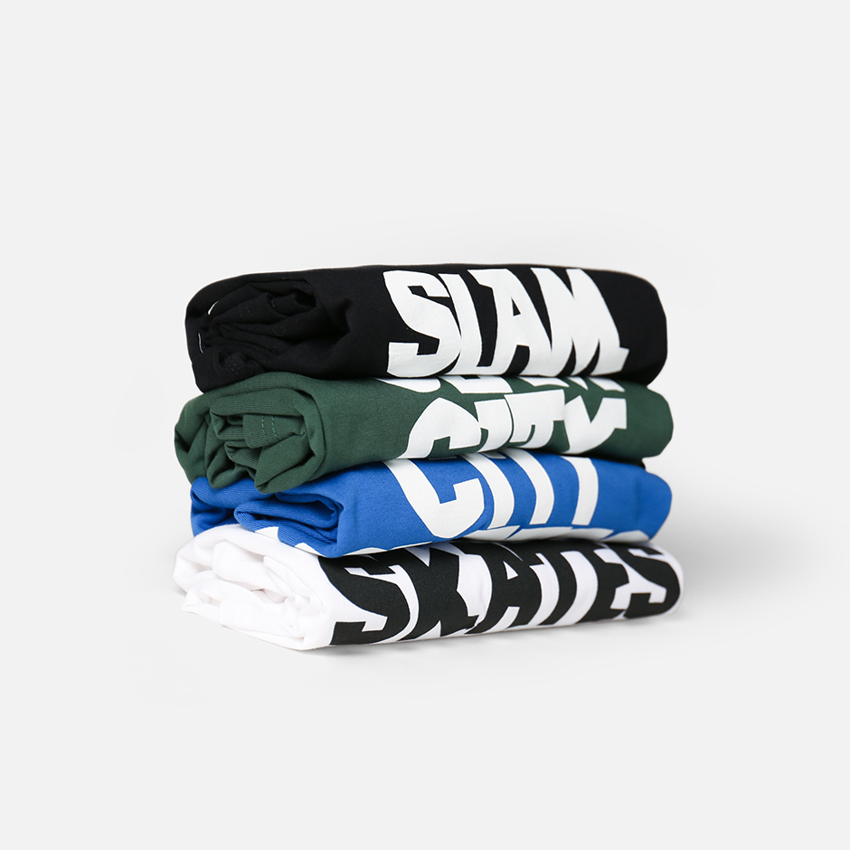
There are three colours available of our Classic Logo Hood. These are joined by four colours of our Classic Logo T-Shirt. Visit us now to add one of these to your wardrobe and check out other Slam City Skates items.
Thanks to Henry Kingsford, Sam Ashley, and Dominic Marley for the photos. Thanks to Olly Todd, Tim Fowler, Helena Long, and David Atkinson for sharing their thoughts with us.
Thanks also to Dan Adams at the Read and Destroy archive and Neil Macdonald at @scienceversuslife for their contributions. We are looking forward to seeing the results of their efforts to preserve the history of our culture.
Read another article about Slam history from this time last year: Skate Shop Day: A Slam City Timeline